An interface can have the right features and still feel unfinished. The buttons dominate the screen. Every paragraph lives inside a card. A title sits closer to the previous section than to the content it introduces. Nothing is obviously broken, but using it takes more effort than it should.
“Make it look better” doesn’t tell a coding agent which decision to change. UI-craft gives that request a process: study the right references, make specific choices, and judge the screen that actually renders.
Start with the screen’s job.
A camera, a settings page, and a publishing flow should not share the same layout just because they belong to one app. Their jobs are different. A camera needs room for the picture. Settings need readable rows. Publishing needs a clear next action.
Before adding a component, ask what the person needs to do here. That question is a better starting point than a collection of attractive cards.
Replace adjectives with decisions.
“Cleaner” can mean almost anything. “Bring the section title within 12 points of its content” tells you what to change. So does choosing one primary action or reducing a row to a leading visual, a label, and one trailing element.
The measurements in UI-craft are starting points for common mobile patterns. Your project’s established tokens come first. The aim is consistency and hierarchy, not forcing every app into the same visual style.
Small controls can make the content feel bigger.
In the published redesign, the source actions on the Create screen became compact controls. That made room for real project thumbnails and a clearer relationship between the action and the work.
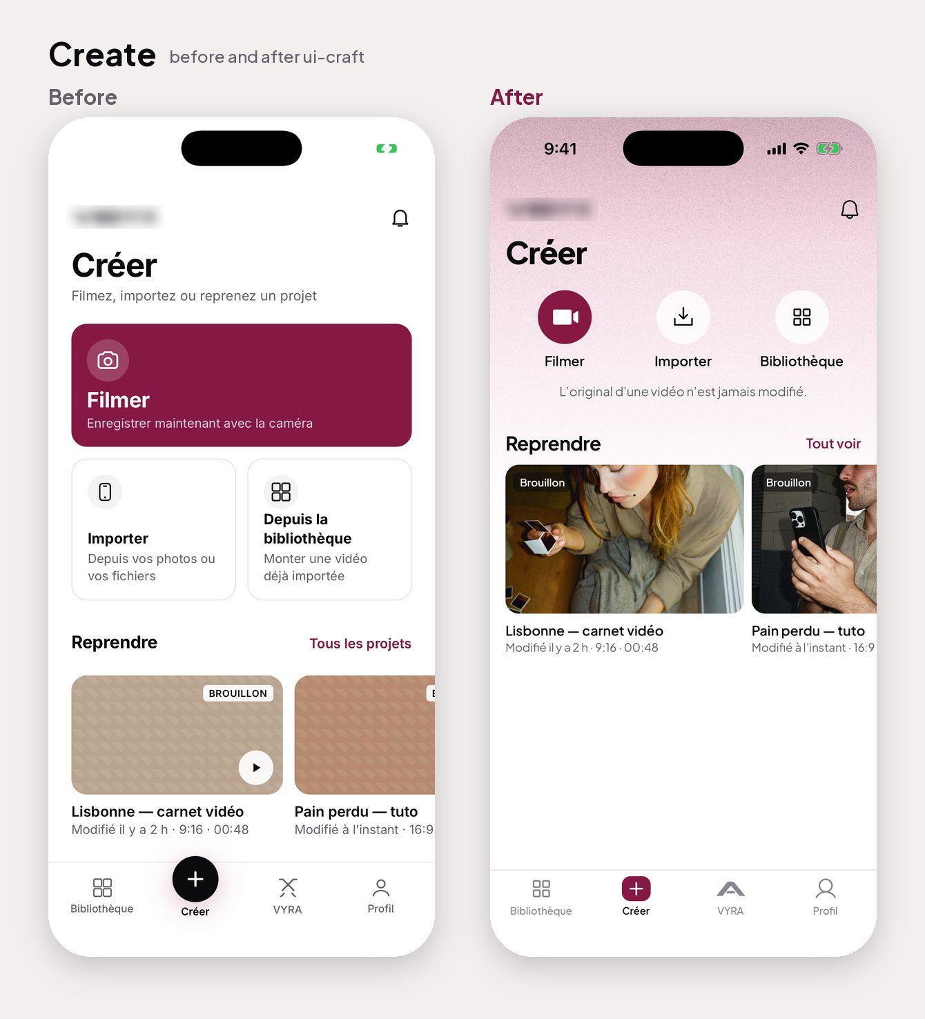
Smaller visuals should still have comfortable touch areas. Compact is useful when it removes noise; it stops being useful when it makes a control hard to tap.
Review what people will actually see.
A component can look sensible in code and still feel wrong on a phone. Real content changes the balance. Long labels wrap. A keyboard covers the action. A status bar carries the wrong contrast into the next screen.
Capture the running app and look at the flow together. Fix recurring issues in shared components first. Then check the individual screens, including empty and error states. Motion deserves the same attention: a transition should explain a change, and reduced-motion preferences should be respected.
Use the skill as a loop.
Choose references. Build. Capture. Review. Improve. The value is in repeating that loop with evidence, rather than asking for another layer of polish.
UI-craft collects the rules, screen recipes, reference notes, and helper scripts for that process. It’s open source, so you can read the reasoning, adapt it to your project, and keep the decisions that improve your own product.
Based on the UI-craft skill and its redesign lessons.